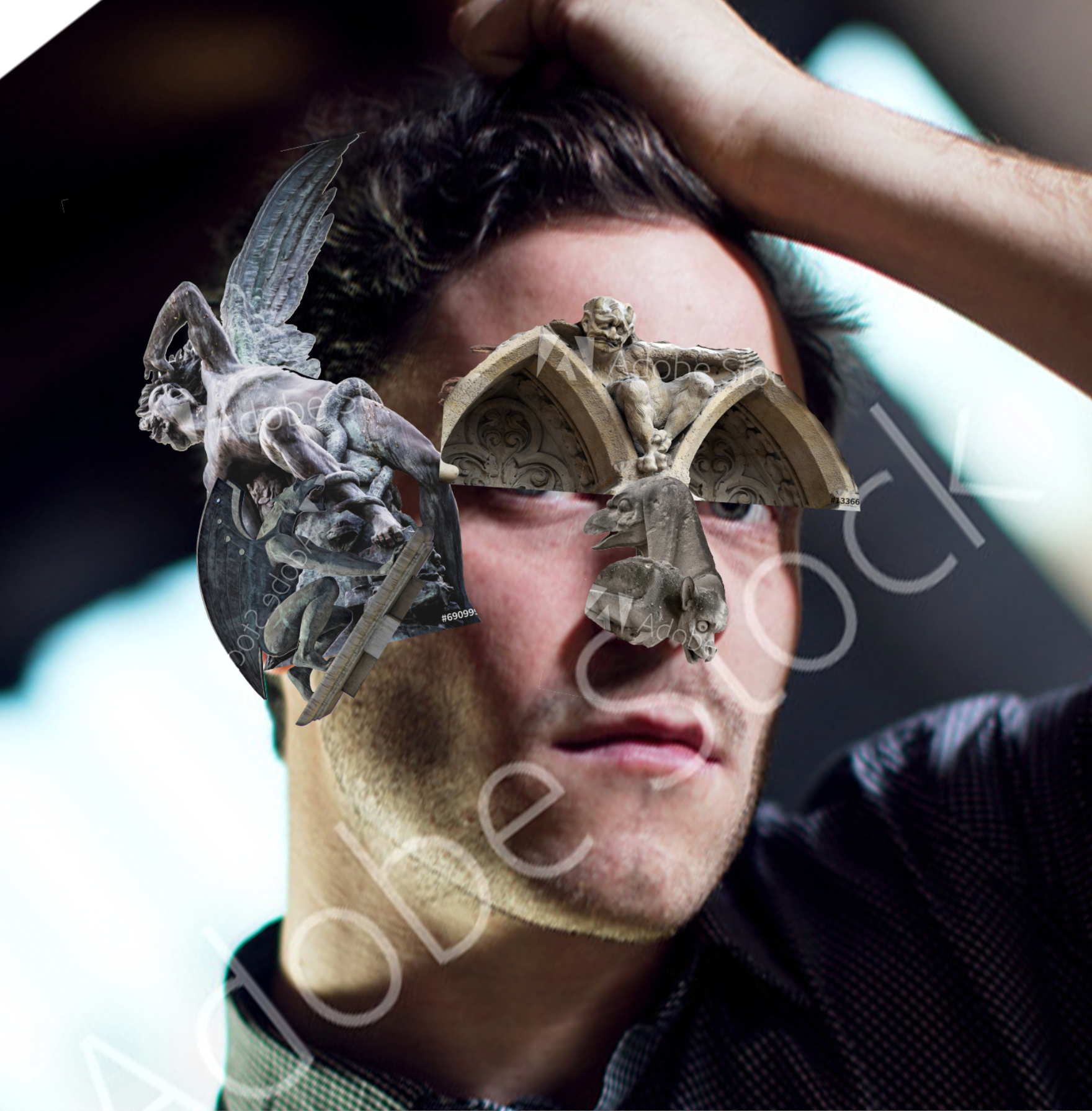
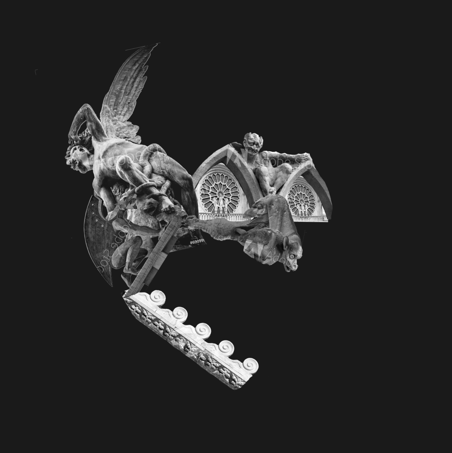
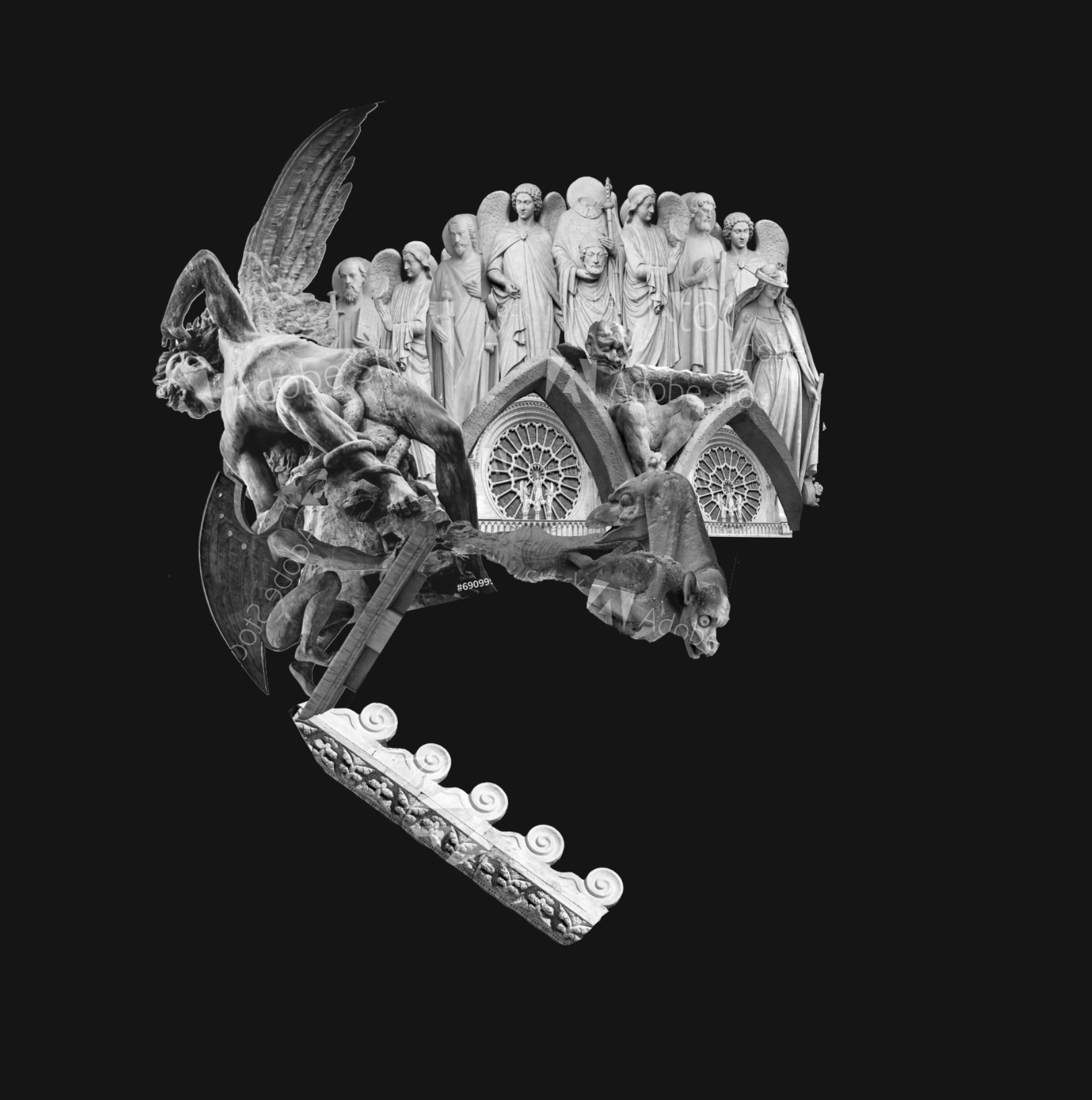
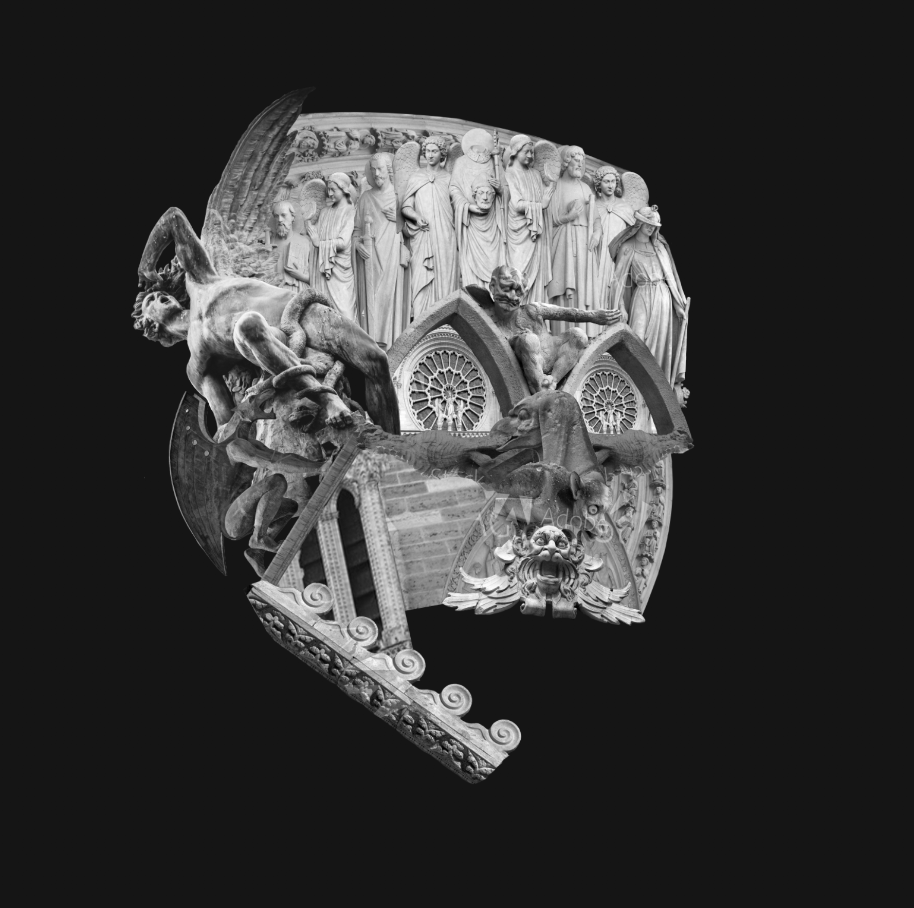
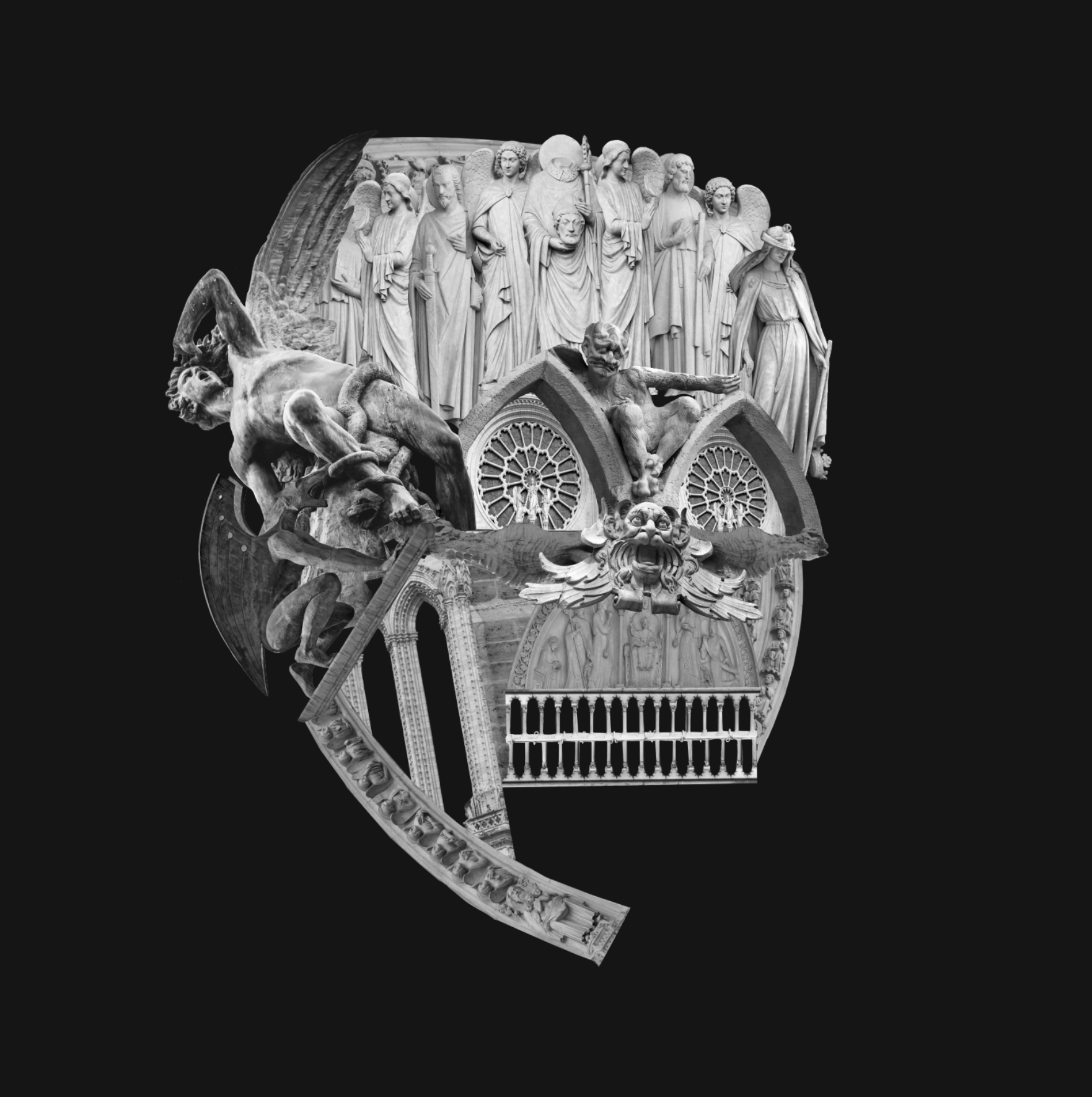
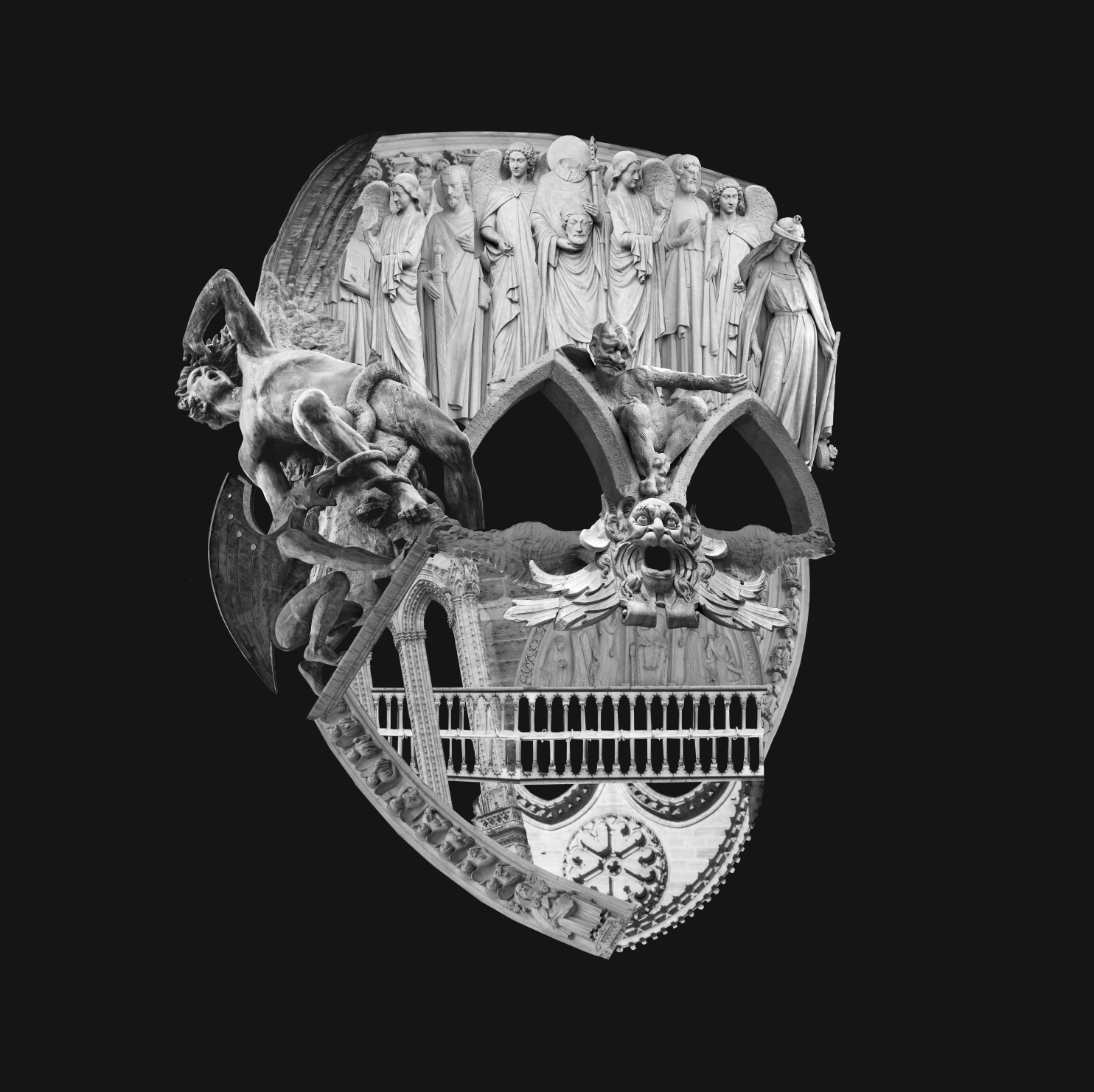
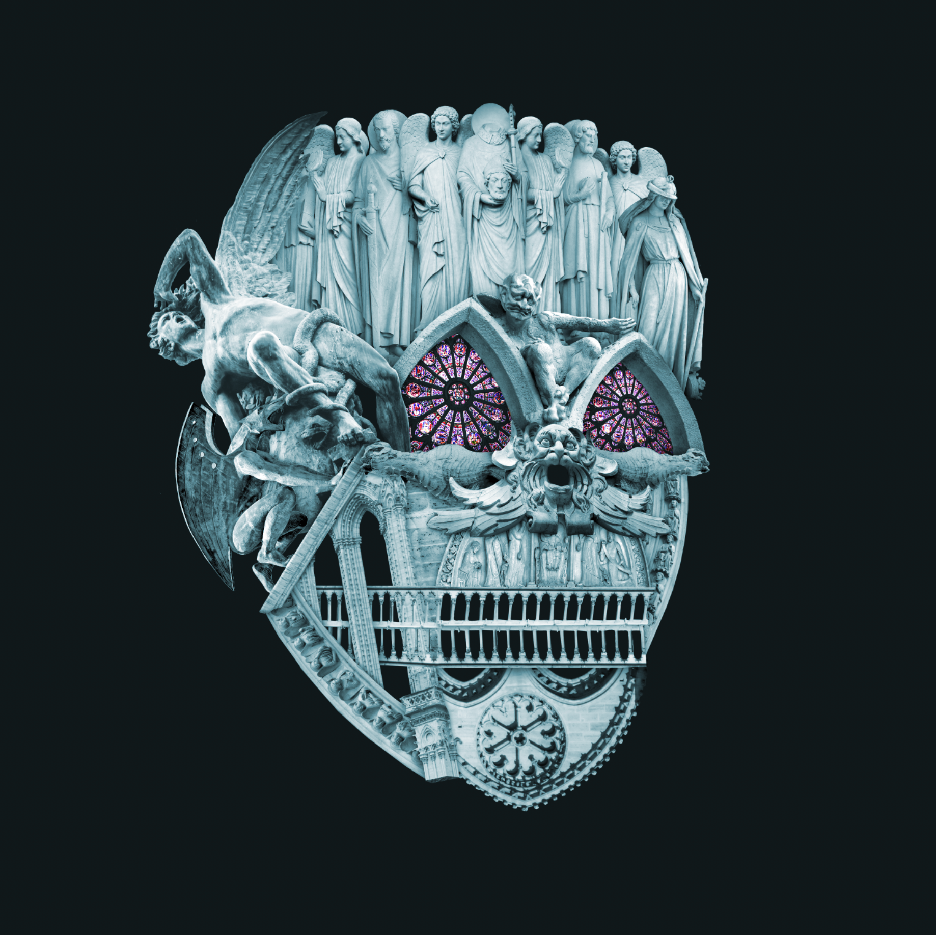
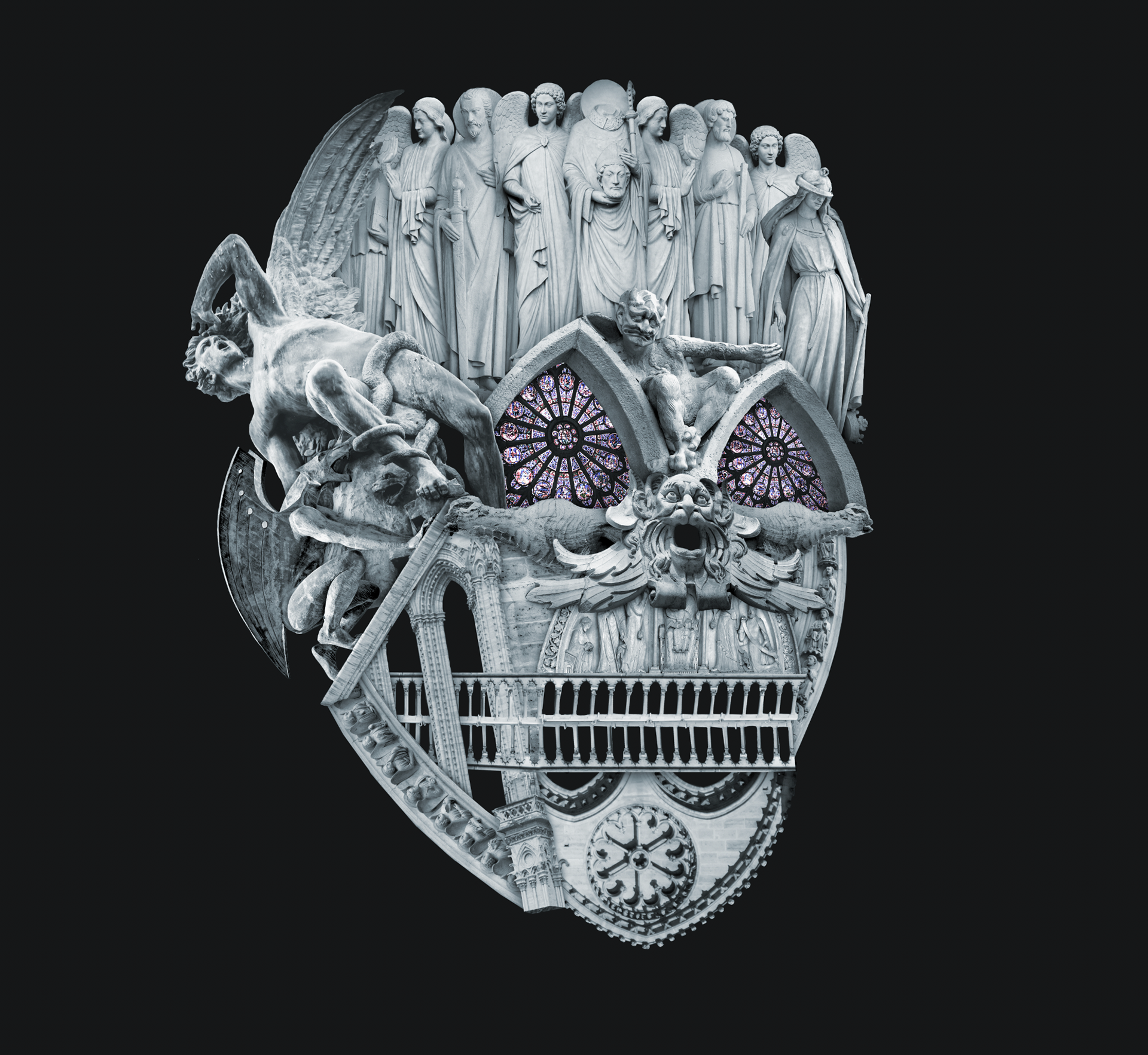
I kept seeing bells in just about every poster I came across for this show. I totally understand why, but wanted to take a different approach for this. I also didn’t want it to feel dated. This is a timeless tale of the underdog becoming a hero. It was important to me to reflect that rather than scream, “PARIS, 1482”. The idea behind the central image is inspired by a lyric from the opening number, “What makes a monster and what makes a man?” Twisted gargoyles and angelic statues of saints build the image of the human skull, echoing the lyric's question of humanity and morality.
The skull is comprised entirely of gothic and gothic-inspired architecture. A keen eye will recognize many pieces from the actual Notre Dame cathedral. It’s also a little nod to one of the songs in the second act, “Made of Stone”. Finally, with death being such a prominent theme of the show, the skull seemed fitting.
Process
Adobe Design Achievement Awards (2018)
Current Semifinalist (Commercial - Print / Graphic / Illustration)